| Leave a note! |
 |
NOTES FROM OTHERS:
|
Cara | 6/2/05 | 23:04 |
| This comic touches a chord with me; Meri Lin and I have something in common. Becoming too 'American' is considred bad by our families and it's ridiculous.
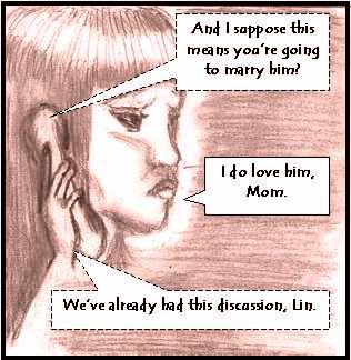
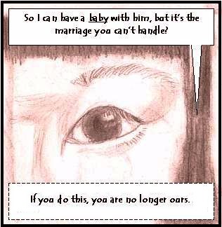
I have no complaints about the script (very good!) but the artwork is not as quite good as comic #2. Panel 6 is the one that needs the most improvement--her hand and phone are too small, especially since the phone was big enough to be seen in Panel 5 from the opposite side of her face and her eye size is much bigger in panel 6 than in 5.
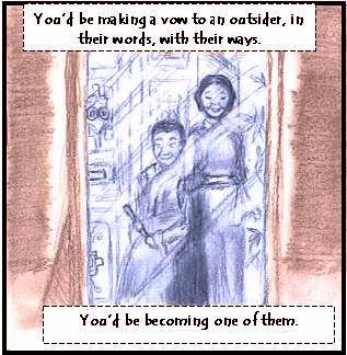
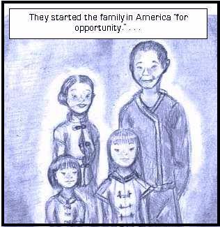
I did really like the drawing of the photograph with the family in traditional Chinese garb--that was my favorite panel. :)
|
|
wingedpanda | 6/3/05 | 7:11 |
|
Fine, call us lurkers out. See if I care.
I'm reading - I like it. ^_^ Meri Lin is very cute.
|
|
Dan M. | 6/3/05 | 10:47 |
I like that I can sort of get a feel for what this might be about and maybe where it's going. I would just advise that you don't wait too long to introduce some sort of action and forward motion to avoid risking it becoming stale.
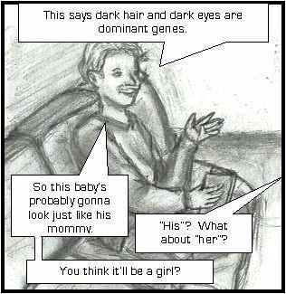
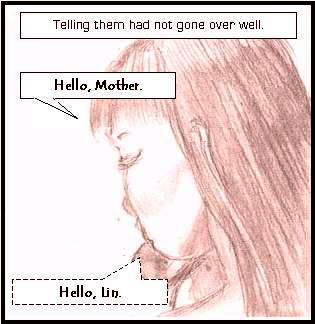
As far as the art work, I really liked panels 3,5 and 8 mainly because you get a real good feel for the look of the characters. Again I like the different shades/colors for the different time frames which is actually really important to do.
The story is based on an interesting topic that I am somewhat familiar with. With this topic I think you could definitely make something of it. I am looking forward to the next comic mainly to see your art skills blossom further. Keep it up!
|
|
Fred | 6/3/05 | 11:35 |
|
Meepmeepmeep!! I like your comic!! :) I look forward to reading more about the characters, and their personalities and backgrounds. You create really cool characters.
|
|
mikey | 6/5/05 | 6:46
|
|
Great drawings the story begins to take more form keep with it and keep me informed
|
Any comments left here are PUBLIC. If you are not comfortable with that, mail me directly.
ALL DRAWINGS AND TEXT COPYRIGHT JSD, SwankiVY2@aol.com, © 2005!
![[hand]](http://negativeone.swankivy.com/shadhand.jpg)

![[hand]](http://negativeone.swankivy.com/shadhand.jpg)

