| Leave a note! |
 |
NOTES FROM OTHERS:
|
linguafranca | 5/27/05 | 6:44 |
| I love your artwork. The first panel looks especially good. I'm a little confused about the story, but hey, it's only the second strip. :)
|
|
Dan M. | 5/27/05 | 14:17 |
WOW! Your drawings are getting better and better! I'm very impressed!
I really liked everything about this comic so far. I have no clue what the correlation is between the first comic and this one, but again, that is what makes me want to see what is next.
I really liked how you switched to the lighter feeling blue-ish color for the "happy flashback" and then used the darker shade for the "present gloomy" parts of the comic.
Again, good job! Yes Ma'am may I have another!
|
|
mikey | 5/27/05 | 18:05 |
| ...it seems that another talent has surfaced boxes 5 and 9 are quite exceptional a good use of shade and definition they're in, I await to see what next comes keep me informed.
|
|
Cara | 11/4/05 | 23:08
|
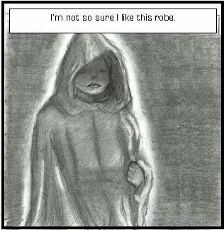
| The robes! I like how they look heavy and give a feeling of prestige with them. A lot of people make robes flimsy looking with paper-thin hoods; I like that you did not go that route. I'm excited to see a younger version of a character I know from your books!
I like the backgrounds of panels 3 and 4. It's symbolic and very nice to look at. But my favorite part of this comic is how it whets my appetite for more about Adele.
|
Any comments left here are PUBLIC. If you are not comfortable with that, mail me directly.
ALL DRAWINGS AND TEXT COPYRIGHT JSD, SwankiVY2@aol.com, © 2005!
![[hand]](http://negativeone.swankivy.com/shadhand.jpg)

![[hand]](http://negativeone.swankivy.com/shadhand.jpg)


